Independently Owned, Locally Grown, Community Loved
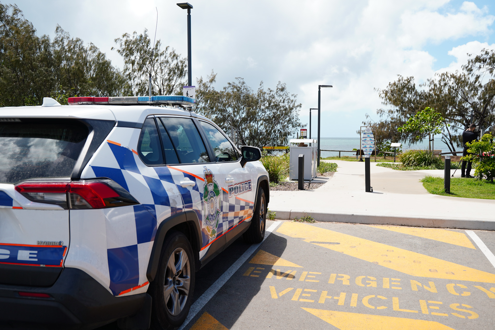


JODY EULER of redhotblue MARK SANFILIPPO of C&C Civil & Mining Construction
Behind every successful creative agency are businesses willing to take a leap, back a vision, and commit to building something meaningful. Real Conversations puts the spotlight on those businesses sharing, in their own words, how strategic branding and marketing have shaped their growth.
With more than 35 years of hands-on industry experience, C & C Civil Mining Construction has earned a reputation for delivering complex projects safely, efficiently, and cost-effectively, without compromise.
While that reputation had secured the company a steady stream of high-profile projects, its marketing had failed to keep pace with its industry standing. Recognising the need for a stronger and more consistent approach C & C set out to elevate its brand. They wanted more than a fresh visual identity they were looking for a strategic marketing partner to help define their direction and communicate their value with greater impact.
What began with a Squeeze Brand and Marketing Session involving the leadership team quickly evolved into a comprehensive marketing strategy, followed by a complete creative rollout that aligned the company's brand with its reputation for excellence. Mark Sanfilippo, General Manager of C & C shares the experience of working with redhotblue and the impact the partnership has had on the company.
Before working with redhotblue, what did you feel was missing from your brand and marketing, and what made you realise it was time for a more strategic approach?
C & C operates in a fast-moving and constantly changing environment, delivering construction and underground ground support solutions while managing ongoing tendering, planning and project execution. Our work relies on experienced, multi-skilled people who are focused on engineering, building and delivering complex projects safely and reliably. That focus can be all-consuming, and historically we have relied on our reputation for safe, dependable delivery rather than actively promoting our brand. As the media landscape has changed, and as client teams continue to evolve, we recognised the need for a more strategic approach to telling our story. What had been missing was a clear and distinctive way to represent who we are, what we do, and what sets us apart from others in the industry.
The project began with a Brand and Marketing Session and evolved into a complete marketing strategy and creative rollout. How did that process help clarify your business direction and change the way you communicate your value to the market?
We identified redhotblue as the right partner to help us clearly define our marketing strategy into a long-term campaign instead of randomly advertising on billboards and other mediums without a coherent, structured and strategic approach. The redhotblue Brand and Marketing Session was an effective way of defining what our brand meant to us and what value we offer to our clients based on the values we uphold and strive for, the way we respect employees, suppliers, subcontractors and clients and the high level of value we provide to clients as a reliable resource to build and support their operations and infrastructure. Scott and Jody facilitated the session in a way that was engaging, reflective and genuinely valuable. It helped us identify the foundations of C & C as both a company and a brand we are proud to represent.
Finding a way to represent what you do is a no easy task. Can you share your thoughts about the marketing messaging and creative that redhotblue produced and the impact they’ve had on your presence in the marketplace?
The marketing messaging created by redhotblue was developed from the Brand and Marketing sessions along with subsequent meetings and discussions with C&C’s management team. The messaging developed is a reflection of our history, values and experience as a reliable contracting partner for our clients and was communicated in standout creative aesthetics which conveyed our brand uniquely. The hero graphic created by redhotblue is truly unique when compared to the standard advertising displayed across our region. The consistent messaging, strategic approach and unique aesthetics provided by redhotblue has set us apart in the marketplace and provided an overwhelming positive response to the campaign.
Publishers Indemnity. Any individual or entity that places advertising, supplies copy material, or submits editorial content to Core Life Publishing agrees and undertakes to ensure that all such material:- Does not infringe upon any copyright, trademark, or other intellectual property rights;- Is free from any content that could be considered defamatory, libelous, or slanderous;- Does not infringe upon any rights related to privacy or breach of confidence;- Contains no obscene, indecent, or otherwise unlawful material;- Complies fully with the Trade Practices Act and all other applicable laws, regulations, or statutes.Furthermore, by submitting or placing such material, these individuals or entities agree to indemnify and hold harmless the publisher, Core Publishing and Events Pty Ltd, and/or its agents from and against any and all investigations, claims, demands, liabilities, damages, costs, or judgments arising out of or in connection with the material provided. All material is believed to be accurate at the time of printing and remains the copyright of Core Publishing and Events Pty Ltd.
© 2026 Mackay and Whitsunday Life Pty Ltd.